KINE MAS is a physiotherapy clinic situated within a sports club in the heart of the city of Antwerp, Belgium. The primary goal of the client was to announce its opening, inform local residents about its services, and attract new users. Meeting the project's requirements presented a challenge, and communication was essential in achieving successful, versatile, and satisfactory results.
The Creative Challenge
The client's initial goal was to establish a brand identity featuring a logomark (a symbol or an icon) and a wordmark (the name of the company). He asked for a design that was simultaneously simple and dynamic, capable of effectively resonating with a diverse target audience, ranging from young individuals to seniors. Furthermore, they needed to visually convey their services in both physical and digital formats. All of these objectives had to be achieved within a tight budget while adhering to advertising regulations in the medical field in Belgium. For instance, these regulations prohibit city-wide poster advertising and limit door-to-door flyer distribution to a one-time occurrence.


A Versatile Approach: The Power of Illustration
In collaboration with the client, it became clear that there was a need to create a versatile visual identity that could be easily adapted for a wide range of applications while reducing design development time and, consequently, the final cost. It was concluded that illustration would be an effective tool to communicate the clinic's services, allowing the logo to forgo the creation of a separate symbol and thereby cut down on expenses.
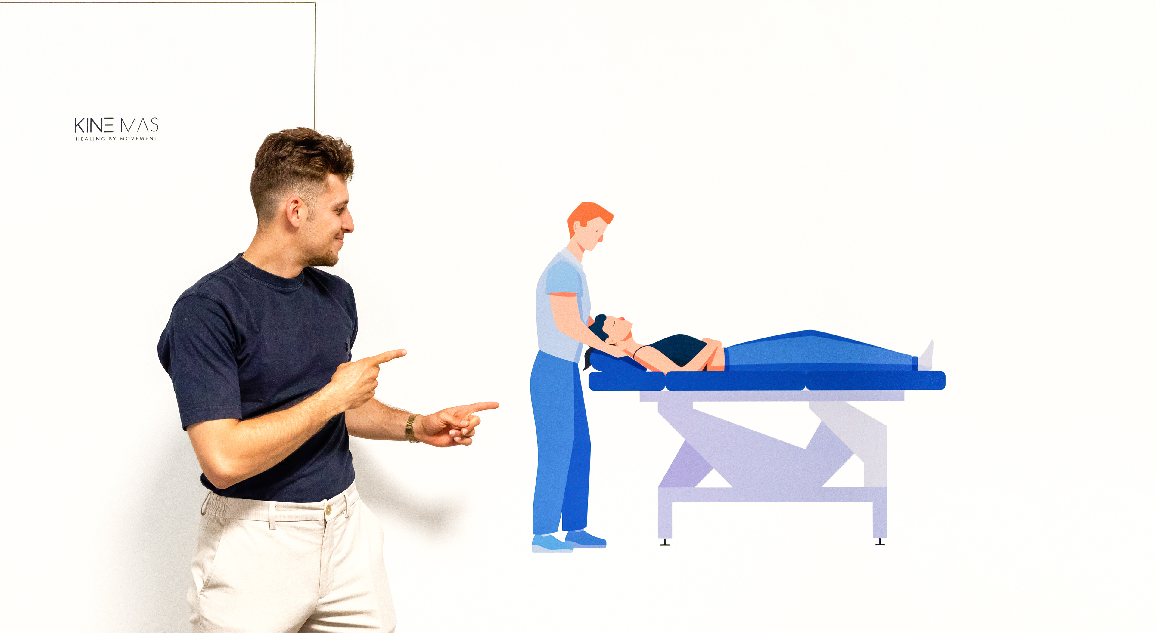
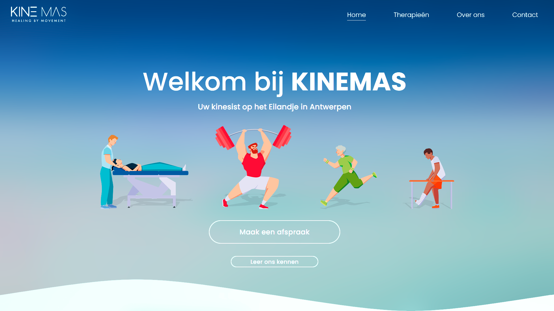
Subsequently, four illustrations were chosen to represent the physiotherapist's specialties: manual physiotherapy, sports physiotherapy, geriatric physiotherapy, and postoperative physiotherapy. These illustrations would embody the clinic's diverse target audience, with the aim to connect with users so that each individual could feel that their specific needs could be addressed. The illustrations feature a dynamic design that conveys vitality and energy, while also maintaining a clean and simple style composed of flat colors and basic shapes.
Thanks to this decision, we were able to achieve an attractive visual identity that met all the initial objectives and budget constraints.
Implementation of the Visual Identity
After laying the foundations of the visual identity and having some meetings with the client, a communication strategy was devised that would align to both the budget and advertising regulations. This strategy included the following brand applications:

Business Card: While the front of the cards displays the logo with the illustrations and contact information, the back reveals an appointment schedule where the physiotherapist can note clients' upcoming visits. This way, the card not only promotes the clinic but also provides a practical experience for users.
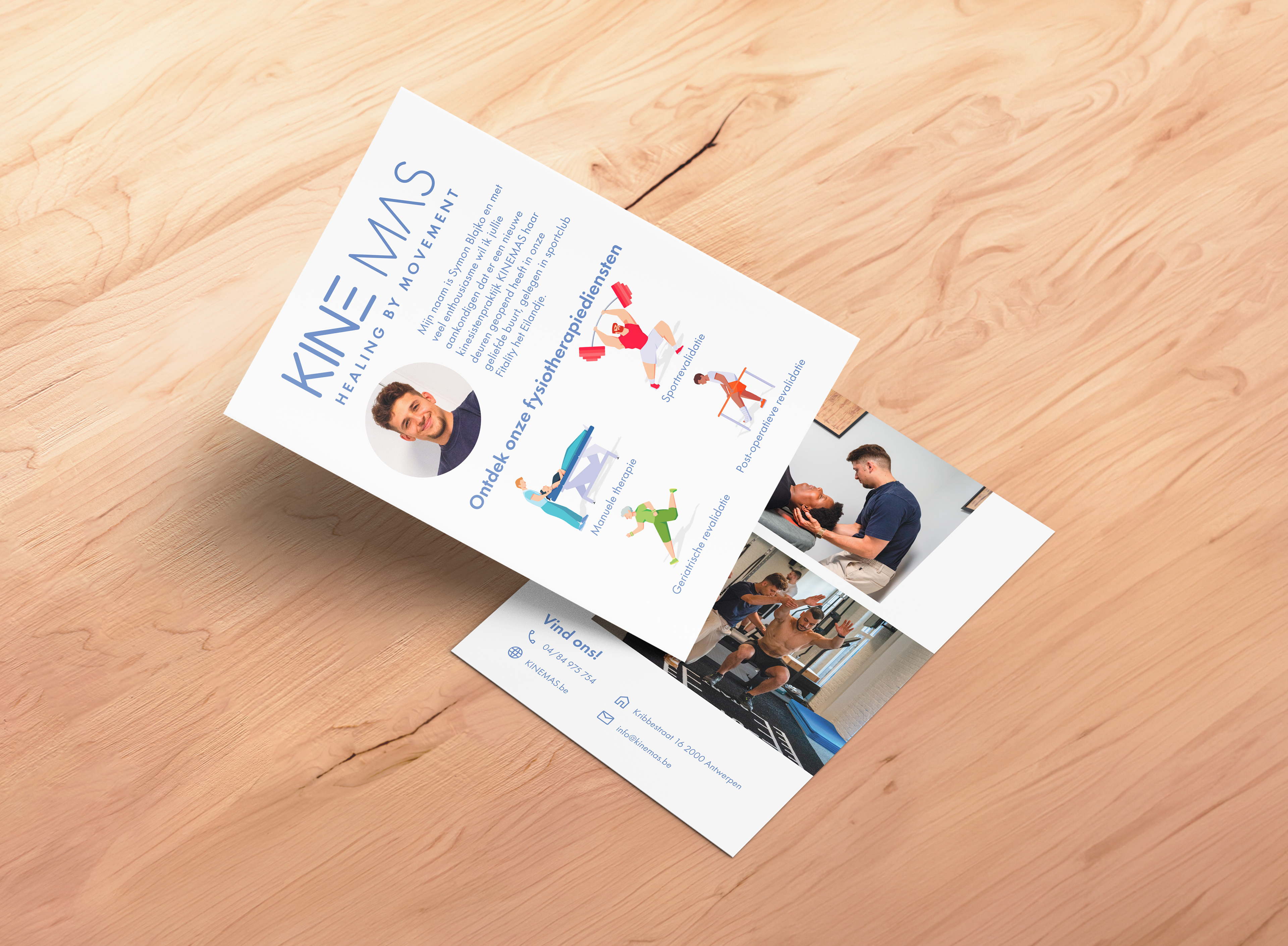
Informative Flyer: This flyer introduces KINE MAS to the public and communicates its services. It serves as a complement to the business cards, offering more information about the clinic, promoting it within the sports club, and reaching a wider audience by handing it out to homes throughout the city of Antwerp. Considering that the flyer will be distributed just once, in accordance with regulations, a simpler yet effective design was chosen to ensure that essential information about the clinic and its services is presented clearly and accessible to all.
Signage: The visual identity has been employed to guide patients to the clinic within the sports club. Additionally, the logo, alongside the illustration representing manual therapy, is displayed at the main entrance, making it easy for visitors to identify the location clearly.
Online Presence: The digital versions of the illustrations were delivered for a web designer to incorporate them into the clinic's website. Moreover, these illustrations will accompany promotions and tips in upcoming social media posts.
Conclusion
Crafting KINE MAS's visual identity presented a creative challenge that highlighted the ability to work efficiently within a constrained budget without sacrificing the quality of the end product. This journey underscored the significance of ongoing communication and collaboration with the client, creating a personalized approach that tailored the strategy to their unique requirements. The end result is a versatile brand that adapts to a diverse array of applications, fulfilling the initial criteria of dynamism, simplicity, and connecting with the audience.